
A personal best tells you a swimmer got faster. It doesn’t tell you why — or whether the improvement will hold up when it matters. Comparing times across a season is the standard approach, and it’s not wrong, it’s just incomplete. Two swimmers can drop the same 0.4 seconds in the 100 free and have completely different stories underneath: one improved a genuine skill, the other got lucky with a start or a taper. If you’re only tracking times, you can’t tell them apart.
Most season-tracking tools — spreadsheets, SwimTopia-style dashboards, meet management exports — are built around the same data: date, event, time, maybe a season-best flag. That’s useful for eligibility and meet entries. It’s not useful for coaching decisions about what to work on next.
What video-based comparison adds that a stopwatch can’t
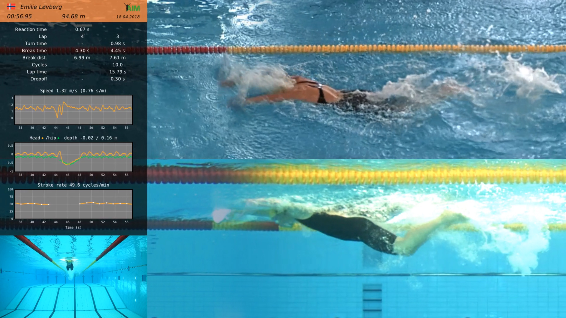
Video-based race analysis lets you compare the components of a swim, not just the final number. With markerless tracking — no wearables, no sensors stuck on the swimmer — you can pull out wall velocity, stroke rate and length, breakout distance, entry angle, and kick count off every wall, for every race, automatically. AIM Systems does this straight from race footage, so the comparison isn’t “swimmer A vs swimmer B’s time,” it’s “swimmer A’s turn mechanics in January vs March.”
That changes what a personal best comparison actually shows you:
- Wall velocity trends. A swimmer might drop time purely from a faster push-off, while stroke mechanics in open water stayed flat or even got worse — that’s a different training priority than someone who improved mid-pool speed.
- Technical fatigue. Stroke mechanics breaking down in the back half of a race is visible on video well before it shows up as a slower time. Tracking this across a season tells you whether conditioning work is translating to technique holding up under fatigue.
- Underwater phase consistency. Breakout distance and kick count off each wall can be compared meet to meet, showing whether a swimmer is repeating a race plan or improvising each time.
- FINA points in context. A FINA points jump looks great on paper; seeing it next to the underlying mechanics tells you if it’s repeatable or a one-off.
This is the layer that raw time comparisons miss entirely. A season-best chart can show you the outcome. It can’t show you the mechanism.
How to actually build this into a season review
Don’t wait until end-of-season to look back. Pull race video and data after every meet, and log the same handful of metrics each time — wall velocity, stroke count, breakout distance — alongside the time. By the third or fourth meet, patterns show up: which swimmers are improving mechanics versus which are just riding conditioning gains, and which technical breakdowns keep recurring under fatigue.
Because AIM Systems processes swim footage into an exported film with data overlays plus a full dataset in under two minutes, this doesn’t require a video analyst on staff — the turnaround fits inside a normal meet-day or practice review, not a separate project.
None of this replaces the time on the clock — that’s still the result that matters on the day. But if you’re trying to decide what a swimmer should actually work on next, “got faster” isn’t an answer. “Got faster because the turn improved, but stroke mechanics still fall apart on the last 15 meters” is.
If you want to see what this looks like with your own team’s footage, get in touch — no pressure, just a look at the data.
Social Contact